This year has been a slow-motion train wreck on many levels. Americans have understandably been so preoccupied with the election and the unprecedented violations of individual liberties in the name of fighting Covid-19, that there hasn’t been much attention left for what the Federal Reserve and US Treasury have been up to. Furthermore, the battles being waged over “public health” policy have obscured just how awful the US economy still is. The present article provides charts from the Federal Reserve itself (St. Louis branch) to document our alarming situation.
The US Federal Debt
We all vaguely know that tax revenues must be way down and federal spending has skyrocketed, but most Americans probably have no idea how much new debt has been added in just the last year: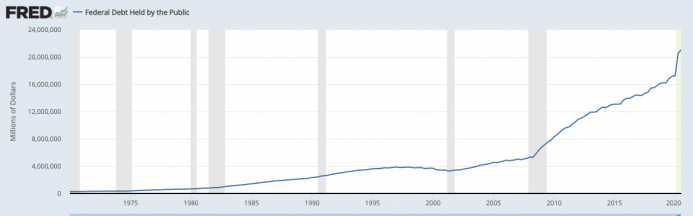
Specifically, at the end of the third quarter of 2020, the federal debt “held by the public” (meaning that this figure excludes intragovernmental holdings such as the so-called Social Security trust fund) stood at $21 trillion and change. That same figure for 3q 2019 was $16.8 trillion, meaning that the Treasury’s outstanding debt increased by some $4.2 trillion in just twelve months’ time. To reiterate, this is how much more Uncle Sam spent above revenues in just one year.
The Fed’s Incredible Buying Spree
Not coincidentally, just as the US Treasury was issuing boatloads of new debt, the Federal Reserve for its part was creating new dollars with which to soak up inordinate amounts of Treasury (and mortgage-backed) debt. Here’s the chart showing total financial assets held by the Federal Reserve System:
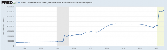
In the chart above, as of mid-December 2020, the Fed held some $7.3 trillion in assets. Just a year earlier it had only held $4.1 trillion—a one-year growth of $3.2 trillion. Notice that the ballooning Fed balance sheet this year far surpassed what happened even in the wake of the financial crisis in 2008.
To understand why the Fed’s actions are so significant, keep in mind that when the Fed buys assets, it creates high-powered “base money” to do so. (Jay Powell didn’t have $3.2 trillion in his piggy bank when the Fed made the above-noted purchases this year.) Besides the potential for price inflation, Austrians recognize central bank monetary inflation as a crucial ingredient in modern business cycles. For more on these ideas, see my forthcoming book (which is being serially released by chapter) on Understanding Money Mechanics.
Just for fun, I took the above chart and overlaid the S&P 500 index: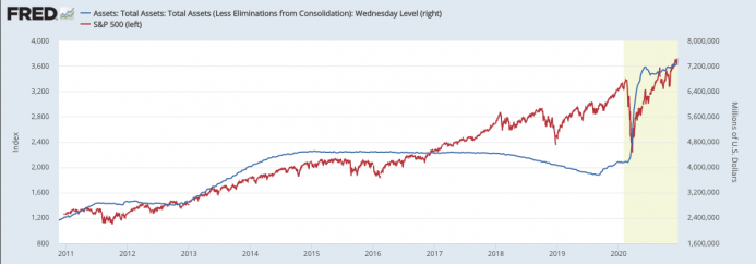
In the chart above, the fit between the Fed’s assets and the height of the US stock market isn’t perfect—it truly had been hand-in-glove during the initial rounds of QE, but for some reason they changed the data availability on the site and now the S&P index doesn’t go back that far—but it still suggests that the record-high stock prices we saw this year are due to Fed money printing rather than the fantastic prospects for US economic growth.
US Employment
Amid the breathtaking issuance of federal debt and base money, the US labor market is in terrible shape. Here’s the official civilian unemployment rate that they report in the news: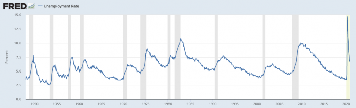
The massive spike in the spring underscores just how disruptive the initial lockdown was. However, note that even now, with the headline unemployment rate (for November) at “only” 6.7 percent, we are still worse off than during the depths of the recession in the early 2000s.
Yet as most readers of mises.org probably know, the official unemployment rate has been very misleading since the economic fallout from the 2008 financial crisis. Specifically, the Bureau of Labor Statistics (BLS) only counts you as unemployed if you are actively seeking work. Incidentally, this isn’t an entirely crazy procedure; my parents live in a retirement community and play golf several times a week. They aren’t working, but that’s not who we mean when we talk of “the unemployed.”
However, the unemployment figure can be very misleading when there are millions of Americans who desperately want to work but who have given up hope of finding a job. Since they are no longer actively seeking work, poof! They’re no longer counted among the unemployed.
One way to sidestep this problem is to ask: What percentage of the civilian labor force does have a job? Yet even here cultural trends can influence the significance of such a figure. For example, more women entered the official workforce in the 1970s and beyond, which tended to increase the labor-force participation rate. In addition, people are living longer while the birth rate has declined, and thus the “aging” of the population also might affect these statistics.
In an attempt to isolate what we really want to know, in the following chart I am just focusing on men aged 25–54. Out of this demographic, what percentage held a job over time? The chart below gives us the alarming result: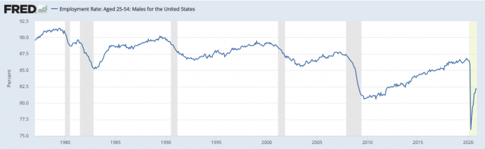
(Note that the y-axis starts at 75, not 0.) As this last chart reveals, among men aged 25–54, the employment rate is not much above the trough it hit following the financial crisis. More generally, we see that with each recession (the gray bars) going back to the 1980s, prime-age male employment never returned to its previous level.
Conclusion
The year 2020 has seen the Keynesian policy solutions—have the authorities print and borrow money—applied in unprecedented fashion. To be sure, no matter how bleak the economy may be, the Keynesians can always say, “It would have been worse without us.” Yet those steeped in Austrian economics understand the importance of sound money and (if we are going to have a government) fiscal prudence. On top of the outrageous lockdowns of business and even residential gatherings, what the Treasury and Fed have done this year is scandalous.