
Thomas Piketty is well-known for his work on estimating income and wealth inequality. That work made him an “economics rockstar” in the eyes of the media, as he appeared to confirm a popular narrative about rising inequality. Piketty’s stats showed a consistent trend across the 20th-century United States. Top income and wealth concentrations followed a U-curve pattern, where the early 1900s were marked by high “Gilded Age” levels of inequality. These levels fell rapidly during the 1940s, stayed low until the 1980s, and rapidly rebounded until the present day as the “top 1 percent” pulled away from the rest of the pack.
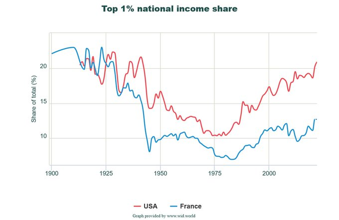
In fact, Piketty claims that US inequality today is higher than it was in 1929—the highest point on the first half of the U-curve. The main culprit behind rising inequality, according to his story, is a series of tax cuts beginning with the Reagan administration. Just the same, Piketty points to the mid-20th century’s tax system, where top marginal rates peaked at over 90 percent, as the reason for the trough in his U-curve. The resulting series of academic articles—often co-authored with Gabriel Zucman and Emmanuel Saez—are deemed as novel and important contributions to the scholarly literature on inequality.
The empirical work of Piketty and his coauthors has attained immense influence in American political life. The media often touts the U-curve and its depictions of skyrocketing inequality since the 1980s as a stylized fact. Politicians and pundits invoke his academic works to justify tax hikes and redistributive programs, all in the name of combating inequality.
What if Piketty and his team got the numbers wrong though? What if inequality wasn’t rising as fast as he claimed, or what if the effects of growing income concentrations were already offset by existing government programs? There would no longer be an empirical case for hiking taxes or expanding government redistribution. That’s the implication of a bevy of recent research articles, showing that Piketty’s statistics could (and should) be discarded in favor of more rigorous work.
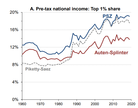
The most recent of these is an article by David Splinter and Gerald Auten in the Journal of Political Economy. Auten and Splinter revisited many of the data construction assumptions made by Piketty and his acolytes in dealing with data from 1960 to 2020. Most notably, they made sure that income definitions were consistent over time, that the proper households were considered (as Piketty et al. used tax units that can be easily biased by demographic changes), and that better data were used. They ended up finding that Piketty’s mid-century trough was not as low as advertised. They also showed that the increase in income concentrations after 1980 was far more moderate than Piketty claims.
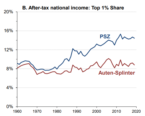
In the main article by Piketty and Saez, the top 1 percent earned 9 percent of all pre-tax incomes in 1980 versus 20 percent in 2020. In Auten and Splinter’s improvements, these proportions are 9 percent and 14 percent, respectively. After accounting for transfers and taxes (something that Piketty and Saez fail to do), Auten and Splinter find virtually no changes since 1960. Piketty and his defenders have thus far attributed the differences to differing assumptions about methodology and the calculation of imputed portions of their series. But Auten and Splinter’s work shows that these assumptions matter a great deal, meaning Piketty’s version is no longer an authoritative standard for evaluating levels of inequality.
But what if we set aside the methodological disagreements about imputed data and focus instead on simply getting the underlying statistics right? It turns out that Piketty and Saez’s original series had multiple accounting errors, data discrepancies, and even historical mistakes in how they dealt with changes to the tax code.
In a recent working paper, we set aside the discretionary disagreements over imputation and only looked at the ways that Piketty and his coauthors handled the underlying tax statistics. At multiple points over their century-long series, they switch out their approaches for estimating the total amount of income earned in the United States each year. This figure allows them to calculate the percentage of those earnings that went to the richest 1 percent, using income tax records.
Oddly enough, Piketty’s most sweeping methodological changes happen at crucial junctures in their depicted U-Curve, such as the sharp decline in income inequality that they depict during World War II. It is no coincidence that these same years coincided with an overhaul of the tax code that standardized how the IRS collects and reports income data. In this instance, we found that Piketty and his coauthors failed to properly correct for the accounting changes, and used an inaccurate estimate of total personal income earnings. Similar errors pervade the entire Piketty-Saez series.
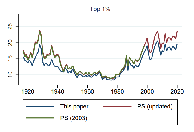
After correcting for these problems, we found that Piketty and his co-authors tend to underestimate total personal income earnings, thereby artificially pumping up the income shares of the richest earners. They do so inconsistently though, as their largest underestimations are from the periods between 1917-1943 and from 1986-present. These errors correspond precisely with the two highest periods of inequality, the two tails of the U-shaped pattern. Shifting to a consistent methodology that does what Piketty and his co-authors aimed to do, but does so more rigorously (we carefully assembled year-by-year data of national accounts components to create a consistent definition rather than use a “rule of thumb” as they did), shows that 40 percent of the differences between Piketty and the work of Auten and Splinter is due to the methodological inconsistencies of the former.
In earlier works published in The Economic Journal and Economic Inquiry, we also found other signs of carelessness by Piketty and his acolytes with data sources pre-1960. They used inconsistent definitions to link discontinuities in tax records. They omitted certain tax filing records after misreading their data sources. They made arbitrary decisions about how to impute gaps in their data, and used unreliable ratios to estimate the effects of accounting changes by the IRS. When we corrected all of these issues, we found that inequality was far lower in the 1920s than depicted. The decline did not start in the 1940s—it started in 1929 and close to two-thirds of it was completed by 1941. Again, the mid-century trough was not as deep as depicted. The combination of all work—the pre-1960 corrections and the century-long consistent methodology can be seen in the graph below where the U-curve is far less pronounced and at a lower level.
Other works have confirmed these points differently. A small list of these suffices to show this. Miller et al. in an article in Review of Political Economy showed that most of the increase from 1986 onward is due to tax shifting behavior linked to the 1986 Tax Reform. Armour et al. in an article in the American Economic Review showed that properly measuring capital gains eliminates all the increase since 1989. In subsequent work in the Journal of Political Economy, Armour et al. confirmed this finding. Finally, a National Bureau of Economic Research by Smith et al. confirmed that all of these findings also apply to wealth inequality. Moreover, work by Sylvain Catherine et al. from the University of Pennsylvania shows that Piketty and his team failed to properly consider the role of social security which—when included—essentially levels the evolution of wealth inequality.
Normally, these findings would be cause to revisit the conventional wisdom around Piketty’s narrative. The problems with his underlying statistics are now well-documented, and newer and better estimates are available to take their place. Those estimates show a weaker U-curve with different timing and magnitudes for its evolution. Most of the decline to the trough is no longer tied to tax rate changes but rather to the effects of the Great Depression. Most of the increase post-1986 is an artifice of accounting and can be probably better attributed to changes in the returns to education during the 1970s, 1980s and 1990s which have since stabilized. Overall, the causal link between high taxes and low inequality (or the inverse scenario) is no longer apparent in the corrected data, which shows a much more nuanced evolution of top income levels over time. Indeed, one of Auten and Splinter’s main findings shows that if you look at top income levels after taxes are paid, the top 1 percent has hovered around a stable 8 percent income share for the last 60 years.
As the study and measurement of inequality progresses, Piketty’s (and his team’s) main estimates have become obsolete and might be properly consigned to the field of the history of economic thought. However, Piketty is now calling anyone who refuses to accept his stats an “inequality denier” and saying it is equivalent to climate denial.
Critics do not deny inequality. They merely want to measure it correctly. Piketty’s own data are deeply suspect and open to challenges that he simply does not want to answer. Labeling his critics as “deniers” is a way of sidestepping the many problems with his own work. That alone warrants not only discarding his estimates but also discounting any future research because of bad academic behavior.