Last year, I created a chart that was designed to illustrate the biggest single political issue of 2010, which revealed the near-complete disconnect that has developed between the federal government’s spending and the median income of American households since 2007.
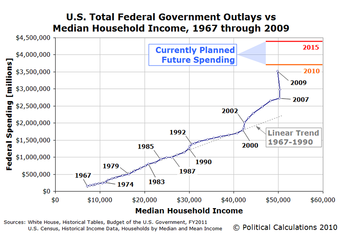
As you can see, the chart reveals how the U.S. federal government’s total spending has changed with respect to the level of the median U.S. household’s income in every year from 1967 through 2009, covering the period in which the U.S. Census Bureau has reported the median income data.
Sharp readers will recognize though that there’s a scale problem with showing the data this way. Namely, the total federal spending data shown in this first chart is way out of scale with respect to the median household income figures.
In a way, it’s a lot like viewing the world’s largest office building, the Pentagon, from the perspective of an ant. You can do it, but big numbers have a way of blurring together and losing their meaning when the scale becomes too mismatched.
To put the chart on a more human scale, we need to rework it so that we’re looking at the relationship between median household income and federal government spending so that both are in terms of households:
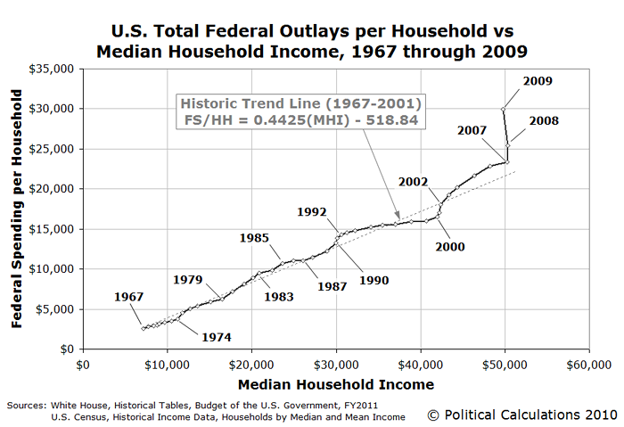
Here, we see that the pattern of the U.S. government’s spending history with respect to the income earned by a typical American household is largely the same as before, only now, we have a much better sense of how much spending that a typical household can support. I next added a trend line to the chart based on the data for the years from 1967 through 2001, the last year the U.S. budget was in surplus.
And that’s when an unexpected pattern jumped out of the chart.
Having recently charted the U.S. government’s budget deficit over time, I recognized that the distance of each data point on the chart from the historic trend line seemed to be almost directly in proportion to the size of the annual budget deficit or surplus for the U.S. federal government.
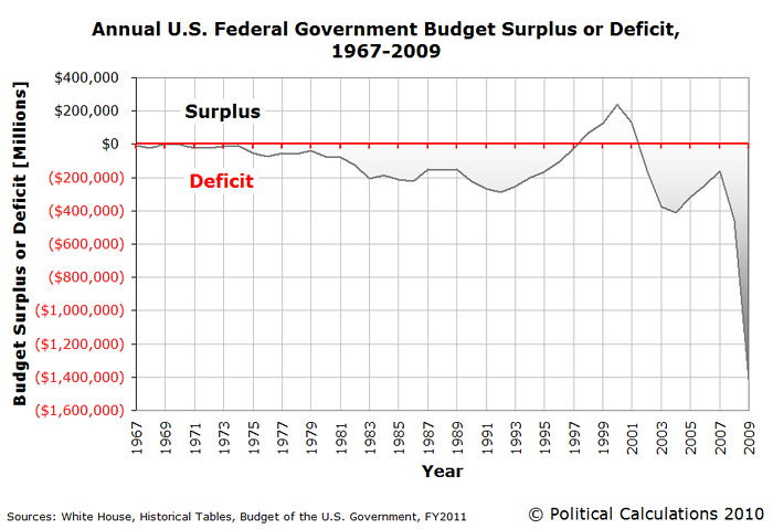
It was almost as if I had taken a chart of the annual U.S. budget deficit, rotated it so that its horizontal axis lined up with the historical trend line I had just drawn, then flipped the deficit chart data about that line.
It was almost, but not quite, perfect! It seemed the historic trend line I had drawn was too high to perfectly correspond to the horizontal axis of the annual U.S. budget surplus/deficit chart.
So I played around with shifting the location of the historic trend line until I came to a result that seemed to closely match the annual deficit chart. I found that vertically shifting the historic trend line downward by $570.75 seemed to come extremely close to providing a perfect match.
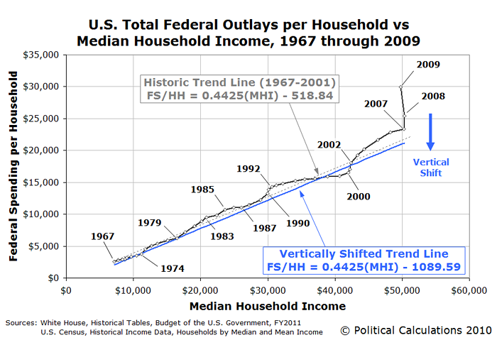
In terms of the context of the chart, this result suggests that if the U.S. Congress had simply reduced its annual spending by just $570.75 per household in each the years from 1967 through 2001, the U.S. federal government’s budget would have been in balance, or nearly so, over most of that time.
This analysis works because the amount of money that the federal government collects in taxes in every year is almost perfectly correlated with changes in the median household income in the U.S. Because that’s the case, that means that what our vertically-shifted trend line really defines is what we’ll call the Zero Deficit Line.
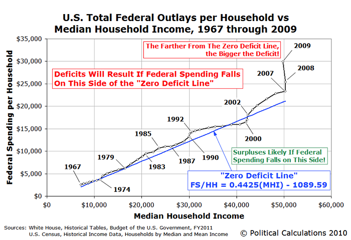
Simply put, when federal spending per household rises above that line, deficits and a growing national debt will result. When federal spending per household drops below the Zero Deficit Line, federal budget surpluses will result and the level of the national debt will fall.
If we look just at the chart’s data for 2009, we find that the amount of the federal government’s spending would have had to be lowered by $8,991 per household to reach the Zero Deficit Line, from a spending level of $29,928 to $20,937 per household. Or about $700 more than what the federal government spent per household in 2004 and about $700 less than what the government spent in 2005.
A Challenge to Incoming House Speaker Boehner
Back in a September 8, 2010 interview on Good Morning America, John Boehner (R-OH) proposed rolling back a significant percentage of federal spending to 2008 levels. Since we now know just how out of whack federal spending was in that year and in 2009, our challenge to the incoming Speaker of the U.S. House of Representatives would be to roll back the total amount of all federal spending back to 2004 or 2005 levels instead.
After all, if you’re planning to roll back federal spending, why not aim at the Zero Deficit Line?